Project Outline
The main goal for this project was to design on campus signage for Sacramento State. Part of the design process included walking through the designated path; from Parking Structure 1 to the greenhouses on campus. The design of the signage is meant to guide and inform those navigating the campus.
Research

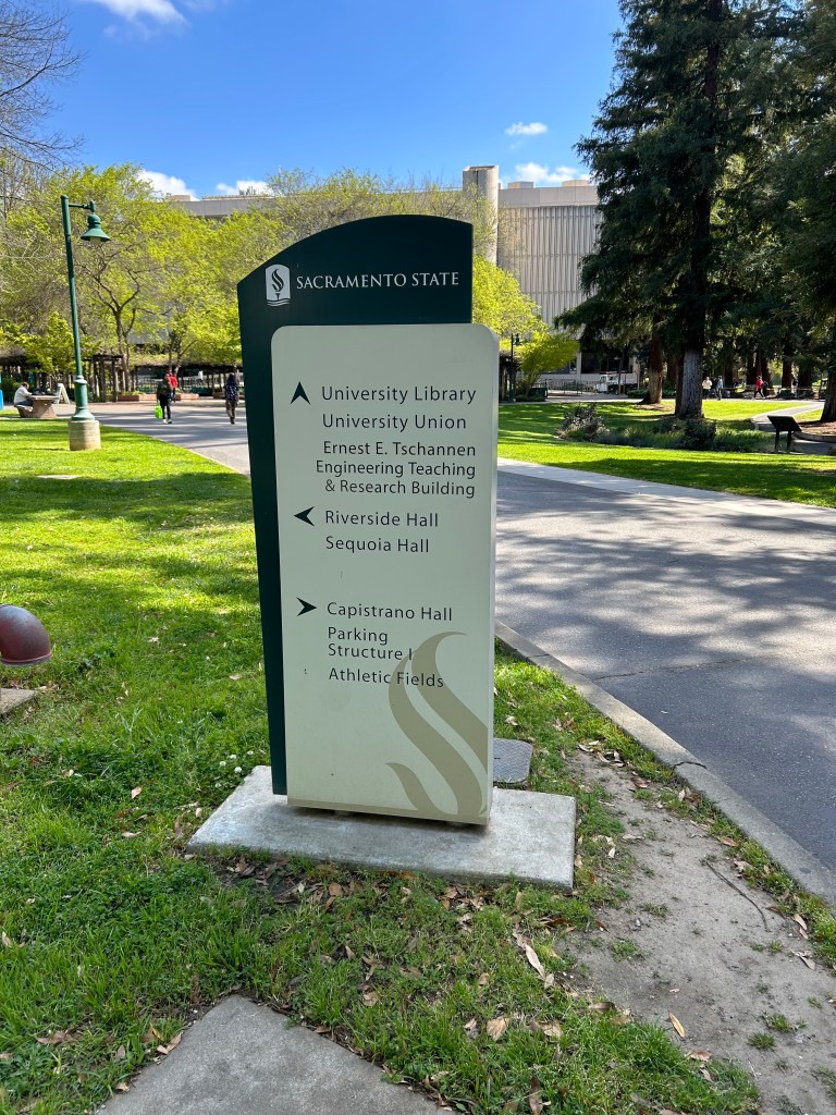
While walking from Parking Structure 1, I took pictures of signage along the way. One type of signage used on campus is a directional signage. This signage shows the names of nearby buildings, along with arrows indicating the directions for corresponding locations. In addition, I noticed that the signage has a lack of lighting, which can make it difficult to read the buildings names at night.
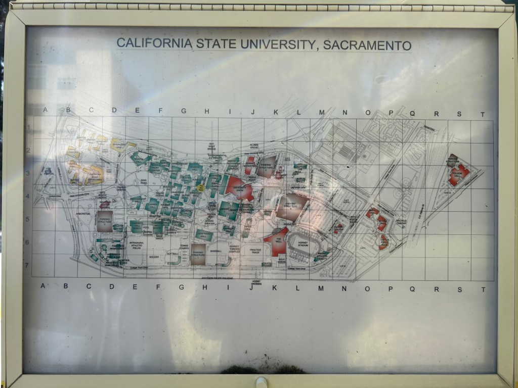
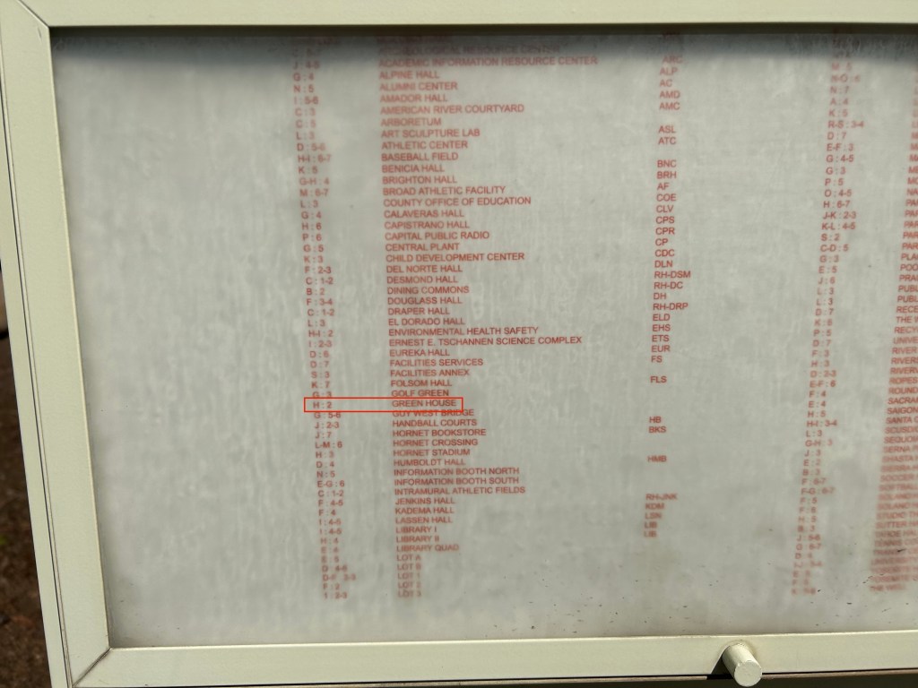
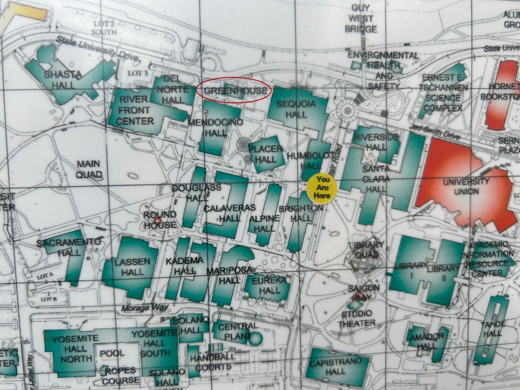
In addition, the campus utilizes maps to help people navigate their way. The map used is in the style of Thomas Guide map, and includes a grid system with letters and numbers. While looking at this map to navigate the path, I took notice that the key shows that the greenhouses is under “H2.” However, the map itself shows that the greenhouses is under “G3.”
Brainstorming
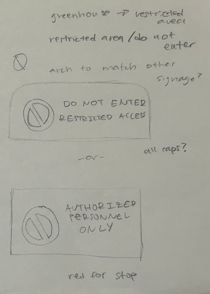
After walking the route, I created sketches of signage to improve on or implement along the route. The first sketch includes a design for a restricted area sign for the greenhouses. Without the greenhouses informing the greenhouses are restricted, people might try to go in. With a clear sign, people will be able to easily tell they are not able to enter the greenhouses.
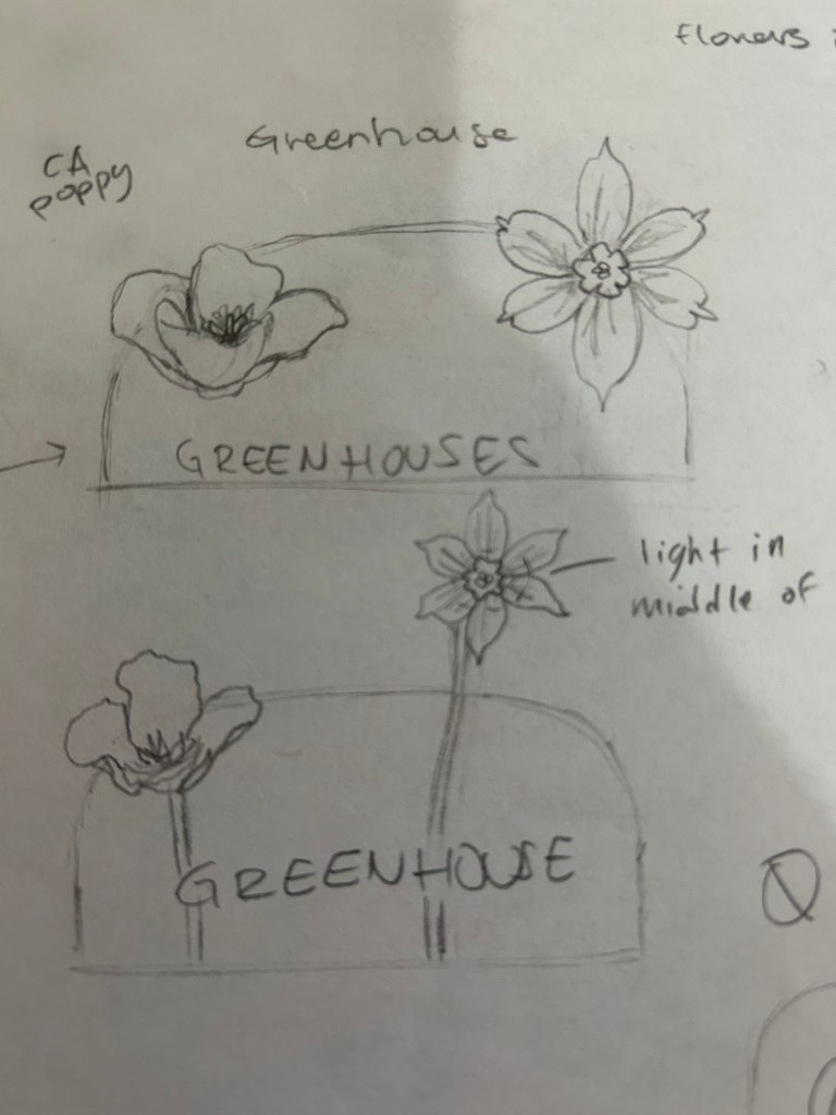
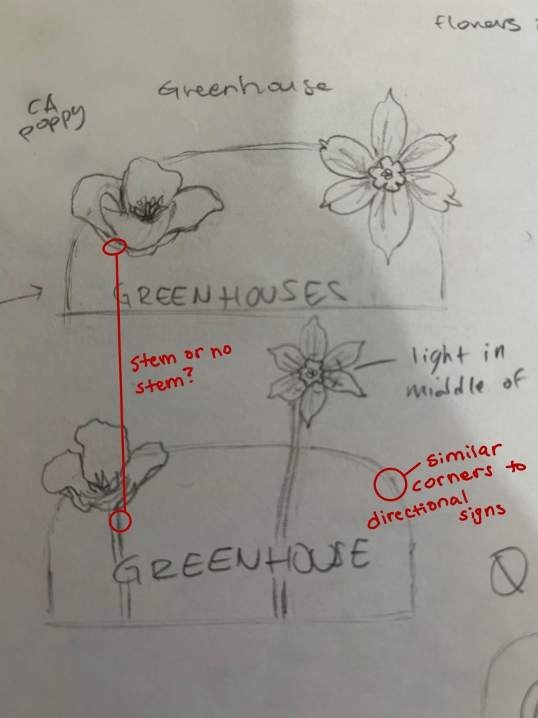
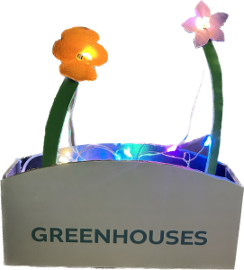
The second and third sketch include designs for informational signage to make it clear when people arrive at the greenhouse. Currently, the greenhouse has no signage to label it as such, which can make it confusing when navigating the campus. The sketch also includes flowers that grow in California to connect back to where Sacramento State is located. Lastly, lights would be implemented to maker it easier for people to read signs at night.
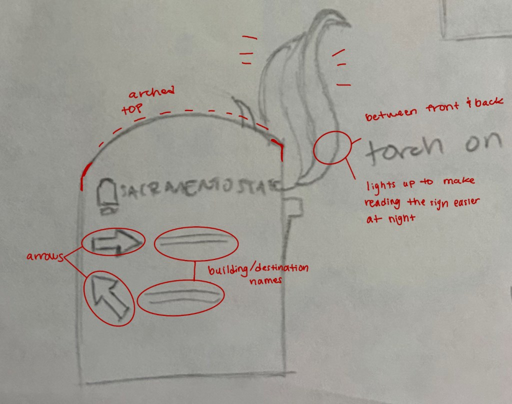
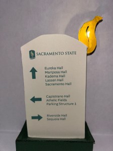
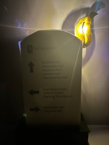
The last sketch includes a design for the directional signage. Similar to the original signage, it will utilize arrows for direction, and will list nearby locations and buildings. To improve the ability to read the signage while navigating at night, the sketch includes a torch with a built in light. The addition of the torch also connects back to the torch see in the school’s logo. In addition, the sketch shows the signage with an arched top to represent strength and support. This connects to the support from the college to help students succeed.
Building Prototypes

After creating sketches for the signage, I then built low and high fidelity prototypes of the signage. The low fidelity prototypes gave me an idea of how to properly shape and put together the cardboard to create the signage. In addition, I utilized a scale of 1/2″ for the prototype to equal to 1′ for the actual signage. With this prototype being low fidelity, I was more focused on the shape and method to creating the prototype with cardboard.
For the high fidelity signage, I used a scale of 1″ of the prototype equal to 1′ for the actual signage. With this prototype being high fidelity, I included labels, such as “GREENHOUSE,” and nearby buildings and locations on the fronts and backs. In addition, I included a light to simulate how it would look when turned on at night. In order to do so, I printed out the labels for each side and glued them onto the prototype. I also painted cardboard for the flowers, and for the bases of the signage. I then stuck lights into the center of the flowers and the torch to showcase where the lights would be located.
