My Identity: Branding Design
My logo represents a firework and bang of movement. In order to create my logo, I used paint splatter.
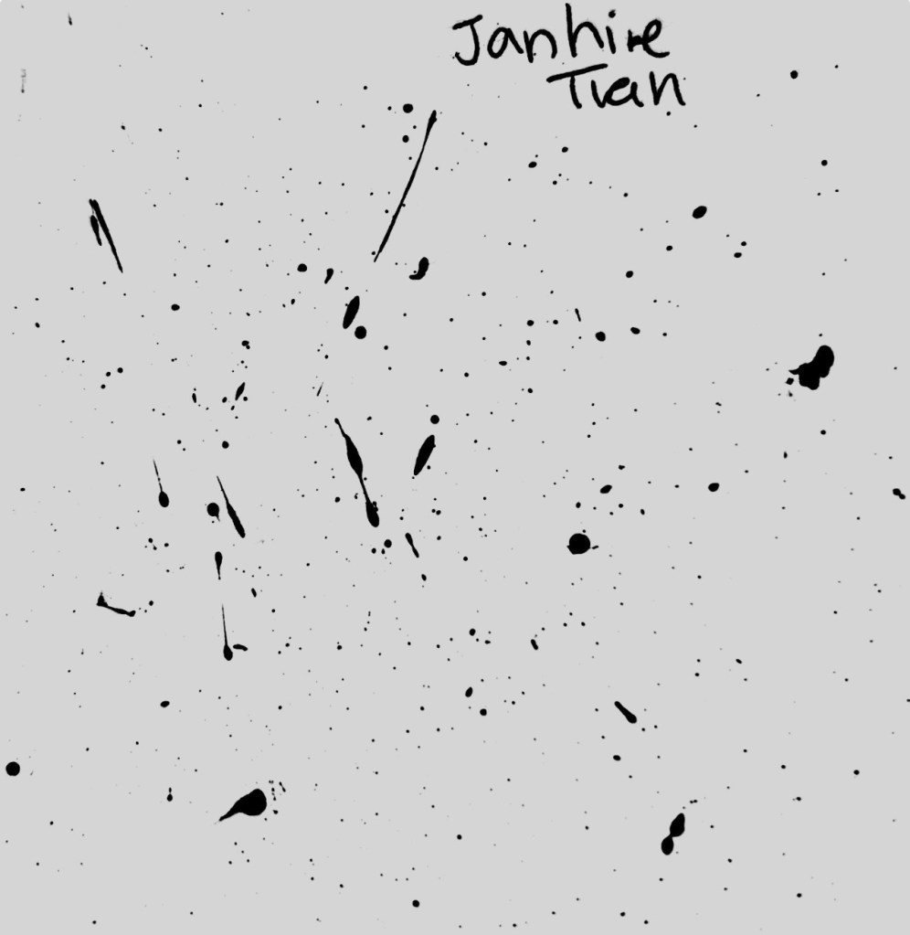
To incorporate analog design with digital design, I used paint splatter for the basis of my logo. I took a paint brush with black paint and tapped the brush on my hand to get a splatter effect.
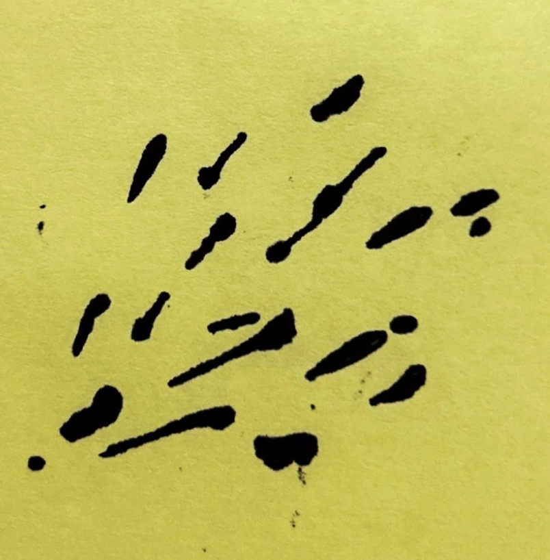

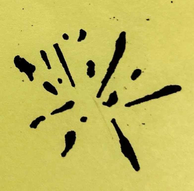
After creating paint splatter, I then created different variations of the paint by arranging them to create different forms. I then digitized the sketches with Adobe Illustrator.


Using image trace, I was able to isolate the different forms from each of my sketches. I then experimented more with the arrangement and the scaling of the paint splatter to create more defined forms. In addition, movement was more emphasized.

For the color palette, warmer colors were used to create a sense of welcoming. In addition, the use of brighter colors creates a burst of energy and movement througout the logo.
