Frightful Film Festival
The Frightful Film Festival is a three day horror film festival. The festival includes horror movies over a span of 50 years. The movies will be played at Crest and Tower Theaters between October 27th and 29th.
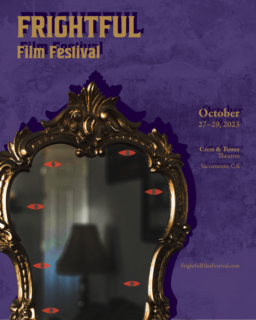
The collateral for the film festival campaign are based on the 16×20″ poster. For the main poster, the fear of being watched was utilized. As shown in the poster, a mirror with eyes is shown. As the viewer looks at the poster, it simulates the feeling of being watched as the eyes are staring back at the viewer. The use of an ornate mirror frame connects back to the horror trope of antique items being possessed or haunted. In addition, the image within the mirror was darkened and altered to suggest that there is alternate, more scary world within the mirror.

The color palette used throughout the main poster and other collateral is a complementary color palette. A purple and gold were used, along with shades for both. The shades of gold were utilized for the ornate mirror and type listing out the event’s information. The shades of purple were utilized for the background texture, long with the mirror’s shadow.

The main typeface used and seen throughout the film festival is “House of Cards.” House of Cards was utilized for this project because it is an ornate typeface, connecting back to the ornate mirror used.

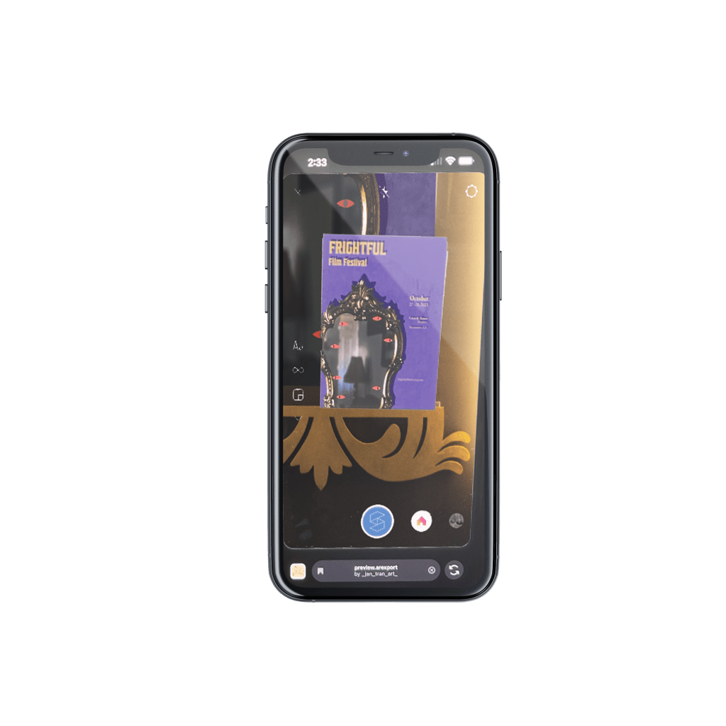
One of the ways the audience finds out about the film fest is through advertising. In order to make the event poster interactive, augmented reality, or AR was used. With an Instagram filter created through Meta Spark AR, the audience has the ability to scan the poster and see an animation of the eyes move. In addition, Adobe Illustrator and After Effects were used to create the animation of the eyes moving. The animation helps draw in the viewer, and the eyes move to look at the viewer with AR.
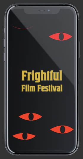


Another way the audience can find out about the event is through a social media ad. To draw the audience’s attention, an animation of blinking red eyes play throughout the ad. In addition, information on the event such as the name, dates and location fade in and out. To make the information stand out, it glows against a dark background.


In addition to the social media ad, the audience can find out about the event through a bus shelter ad and billboard. With both the bus shelter ad and billboard, there is a continuation of the narrative of the original 16×20″ poster. Instead of utilizing eyes in a mirror, the bus shelter ad depicts a black monstrous hand coming out of the mirror. To continue the story of the monster coming out of the mirror, just the hand is depicted on the billboard. The hand shows that the monster is out of the mirror, leaving scratch marks behind.

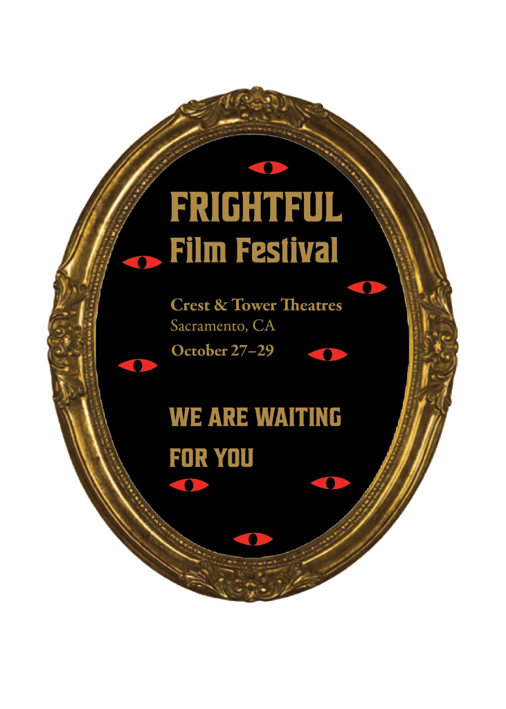
For this film festival, a VIP invite is also handed out to potential attendees. The VIP is an interactive card that the recipient can open to learn more about the event with information, such as the event title, locations, and dates. The front flap depicted an object covered by a cloth. As the viewer lifts up the flap, a golden ornate mirror is revealed. The revelation of the mirror with eyes is homage to the horror trope of haunted antique objects in horror films often being covered with a cloth. The writing, “WE ARE WAITING FOR YOU,” at the bottom of the invite further emphasizes that the viewer is being watched at every moment.
With the event’s website, the audience is able to purchase tickets and find parking. For the event, attendees are able to pick if they want to attend the event at either the Crest or Tower Theatres. In addition, they are able to pick one day or three day passes. As the audience picks the adds or takes away the number of passes, the total is shown by the CHECKOUT button towards the bottom left of the screen. To create a positive user experience, arrows act as signifiers to show the audience that a drop down menu will show when they click on it.
For finding parking, the audience has another drop down menu to look at parking for either the Crest or Tower Theatres. Once the pick a location, the map to the right zooms into the theatre and surrounding areas. This allows the audience how close parking is to the theatre. For Crest Theatre, there is no on-site parking and means the audience needs to park elsewhere and walk to the event. For this location, parkin along with walking time/distance is included.
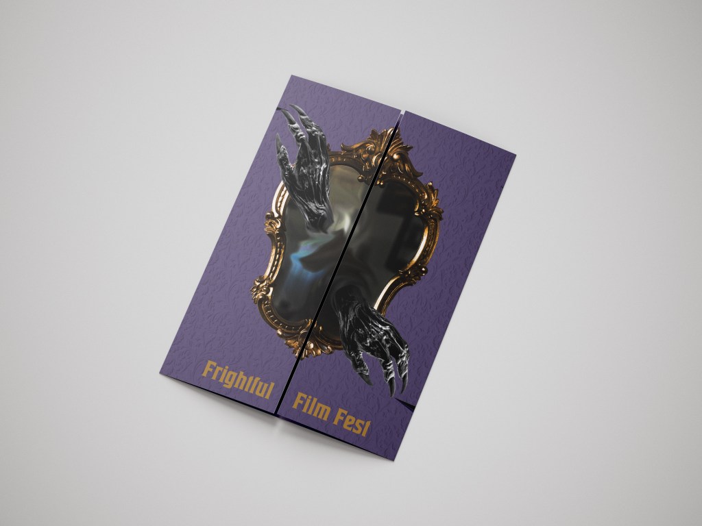
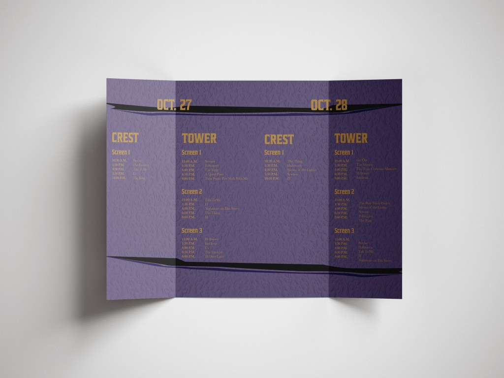

While at the film festival, the audience can grab a brochure. The brochure lists out the three days, and which movies are playing on each screen. Each screen also includes times and at which theatre a film will be played at. The front of the brochure includes the image of the mirror with hands coming out. As you open the brochure, it invokes the feeling of going into the mirror.
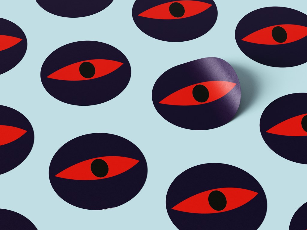


The last part of the event includes the ability to purchase merchandise to commemorate the film festival. Merchandise includes stickers depicting the red eyes, which the audience would then stick on their own mirrors. Another item the audience can purchase is a tote bag covered in differently scaled red eyes, along with the name of the event. For the shirt, hands are poking through the shirt, simulating being trapped within the shirt. This design connects back to the original event poster and the idea of being trapped behind the mirror.
